Request to make websearch icon more obvious when turned on?
Small feature request, I don’t know what other people think but the icon at the bottom of venice is difficult for me to tell if it’s on or off. Could we make it change to a colour that is used in the branding when it is ‘on’? and back to grey when its ‘off’?
I would have thought the brighter icon one was on, but the greyed out one means its on..
off:
on:

I have to double check by going in to the sidebar then scrolling down to the websearch toggle.
Would appreciate if it was more obvious if websearch was on or not.
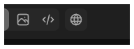
you could add the highlighted box like is used here:

or use blue like this:

Not a big deal but would appreciate it.
Please authenticate to join the conversation.
Completed
Feature Requests
UI Design
Over 1 year ago
Subscribe to post
Get notified by email when there are changes.
Completed
Feature Requests
UI Design
Over 1 year ago
Subscribe to post
Get notified by email when there are changes.